
Post Processing Example I
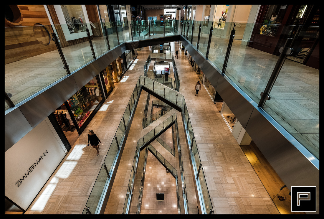
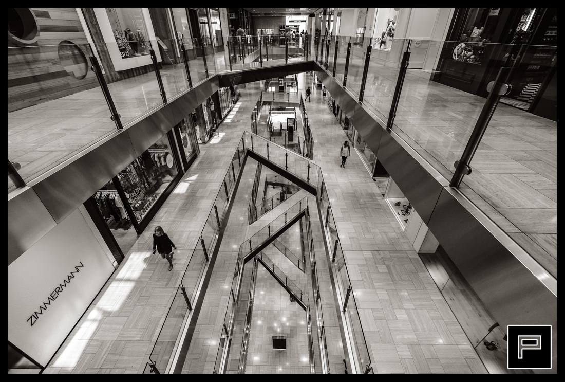
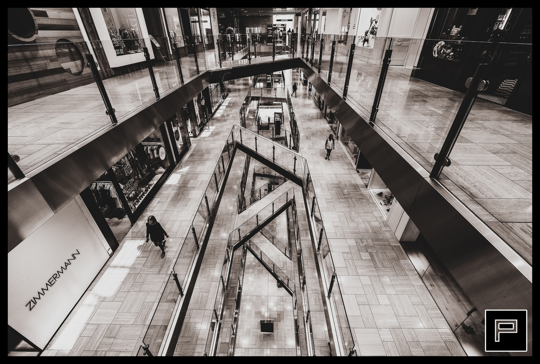
In this example, I'm going to be looking at how to post process an image I recently took and how I can achieve several different looks with the same image. I'll start by looking at the image straight out of the camera, with some slight cropping and exposure adjustment. I don't particularly enjoy messing around with pictures in Photoshop, so the aim of this is a three minute edit in which we turn a nice shot into a great shot.

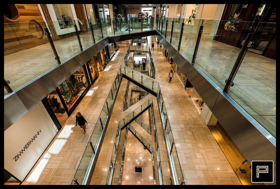
It looks alright, but how about increasing the contrast and clarity in order to give the picture some more punch. Since this image has many strong lines and lots of gradations between bright and dark, it will benefit from the increase in contrast and clarity. Bumping up contrast to +40 and clarity up to +40 as well, we get the following image, a noticeable improvement.
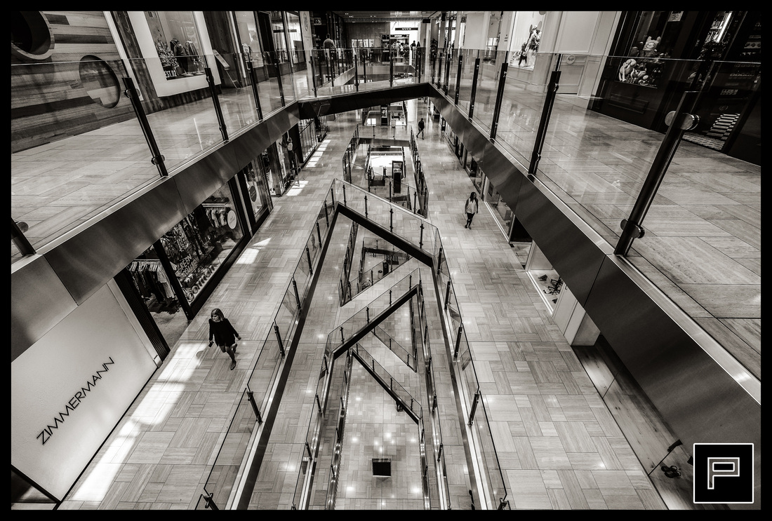
This looks great, but I reckon it can look much better if we made the image warmer, so I'll push up the Temperature to +10, which is adding an amber trim to the image to make it look much more warm. I'm happy with the image at this stage!
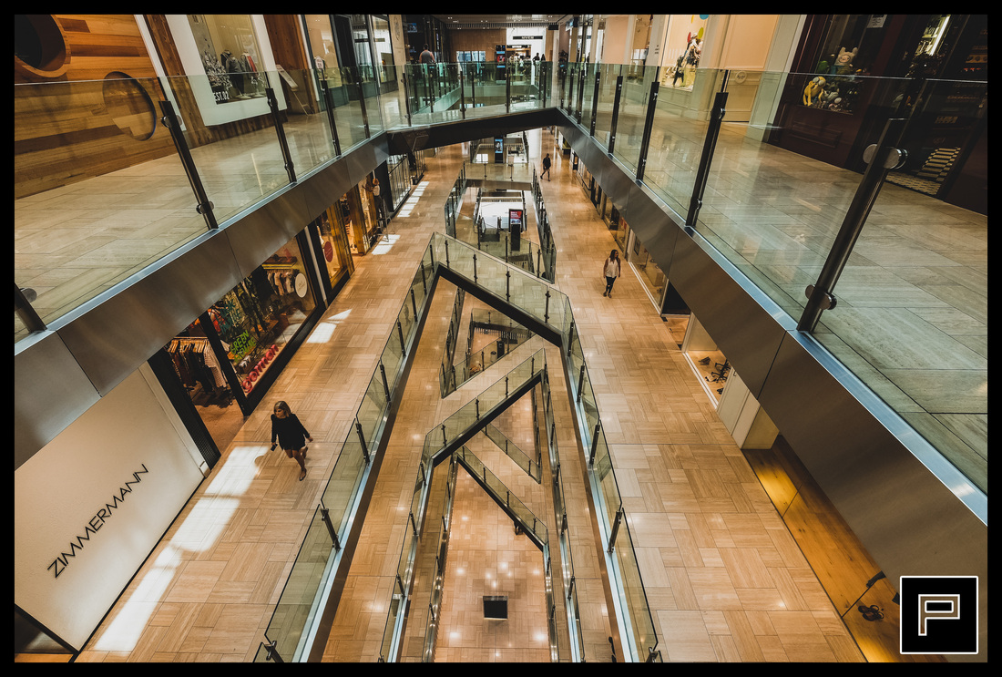
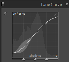
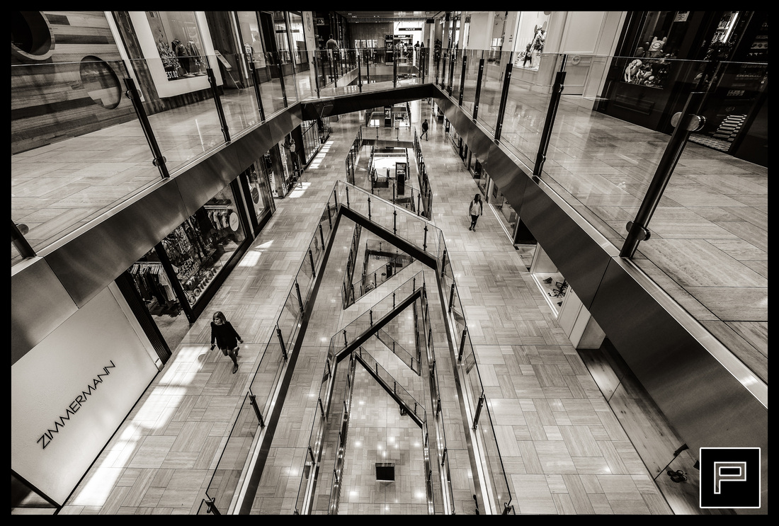
Just to take it a little further, I might want to try giving it a more matte or washed out look, because I think that would look nice with the heavy contrast and presence. And here we go, it looks great when I clip the blacks. I'll put the tone curve at the bottom so you can follow what I'm doing.
Black and White Split Toning
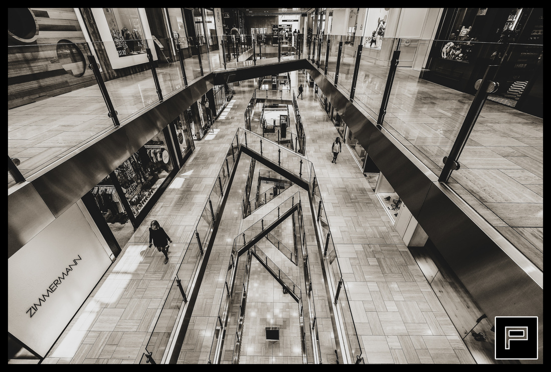
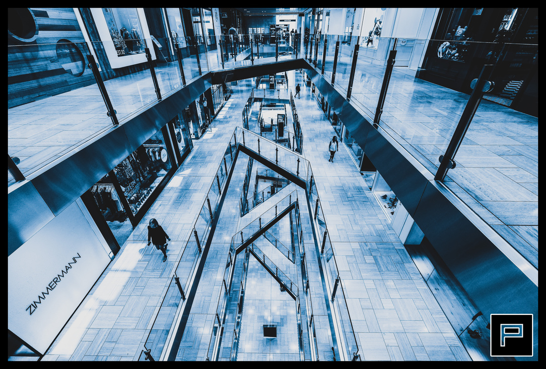
I think this image would look particularly nice as a black and white split toned image, so I'm going to convert it into a black and white image and apply a Tritone. Before going into Photoshop, I'm going to bump the contrast and clarity right up to +60, because B&W images will need more contrast than colour. Right-click in Lightroom and go Edit In, Photoshop. In Photoshop, go Image, Mode, Greyscale (this turns the image into a B&W image). Then go Image, Mode, Duotone. Try a couple of different Presets, but I like Bl 404 WmGray 401 WmGray. Finally, hit Image, Mode, RGB and exit Photoshop, saving your image. It'll go back to Lightroom, I now have this image.
Bumping up the contrast and clarity to +30. It looks pretty damn amazing now.
I'd prefer it a little warmer than it already is, so I'll add +2 to the Temperature setting.
And just because I'm annoying, I'll clip the blacks and give it a matte look here too. This is using the same tone curve as before.
Looks great to me! In the last section, I'm just going to post some alternative edits using some of the other Presets we could have selected in Photoshop.
Alternatives
If you're a little crazy like me, play with the Temperature and Tint settings and you can get some pretty nice Split Tones. The following is a crazy one I managed to make, temperature at -45 and tint at -20.
Afterthought
I don't take editing seriously - the above edits would have taken me around 3 minutes if I was doing it for the first time. Now that I'm used to doing it, 1 minute would probably be around how much time I'd spend. It's not difficult to make your great shots look like much better shots with minimal post-processing if you know what you're doing and you get your shots right in camera in the first place.
